Echoes of Ostov
Echoes of Ostov is a independant project I was part of as a UX/UI and visual designer. I was responsible for designing the four main menu screens, and so my main tasks included illustrating backgrounds, UI design and working with others on the art direction.
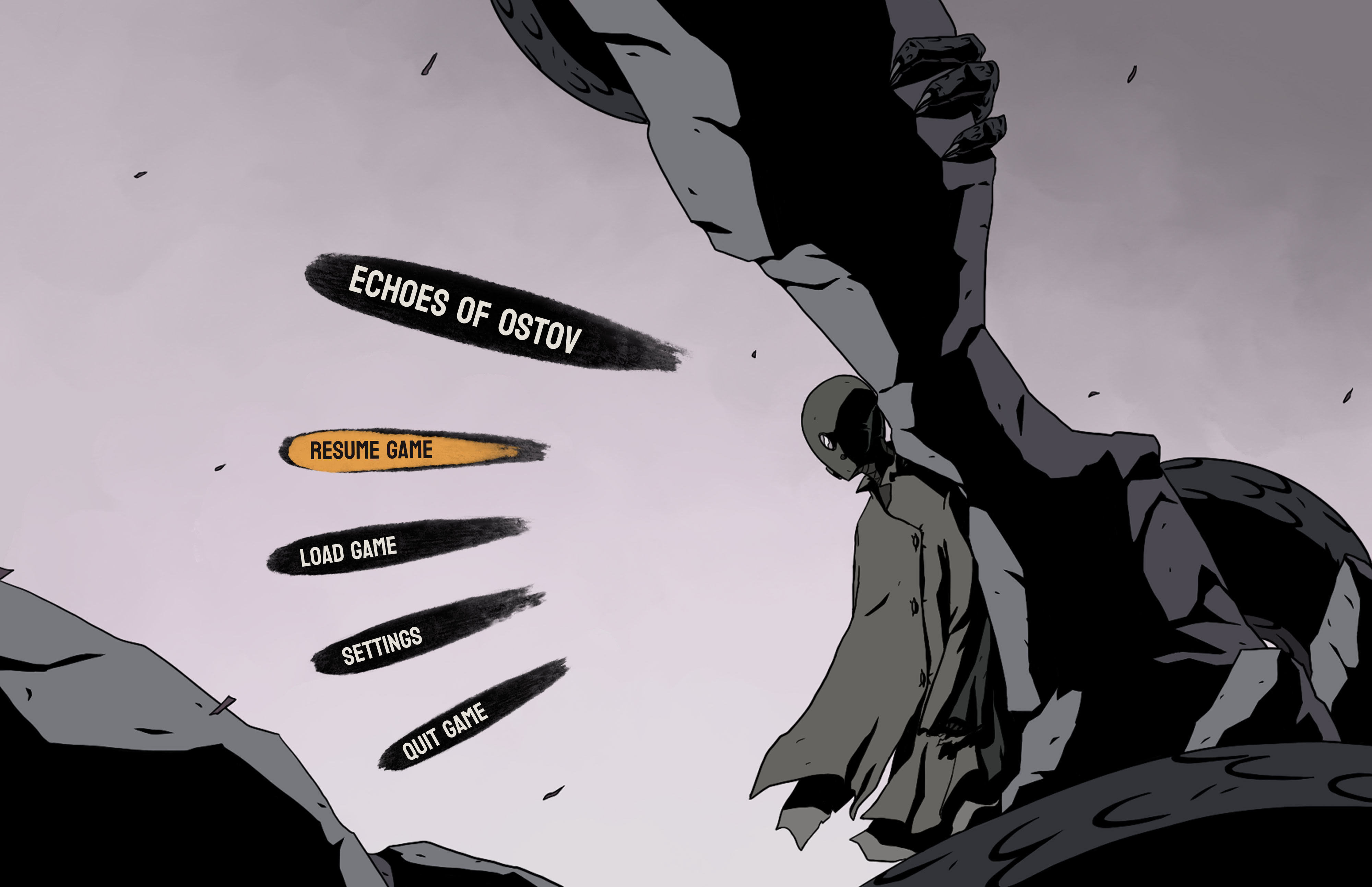

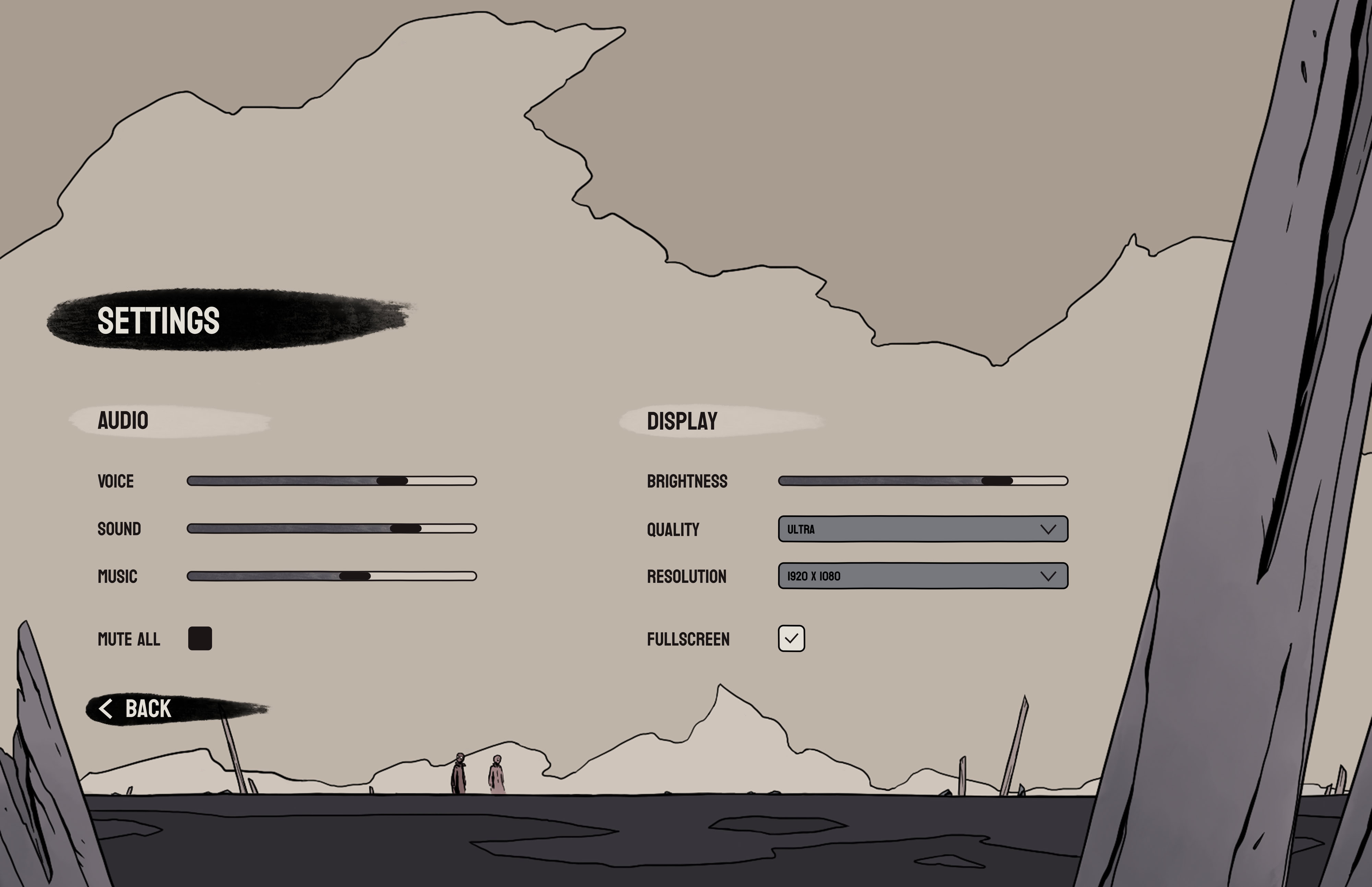
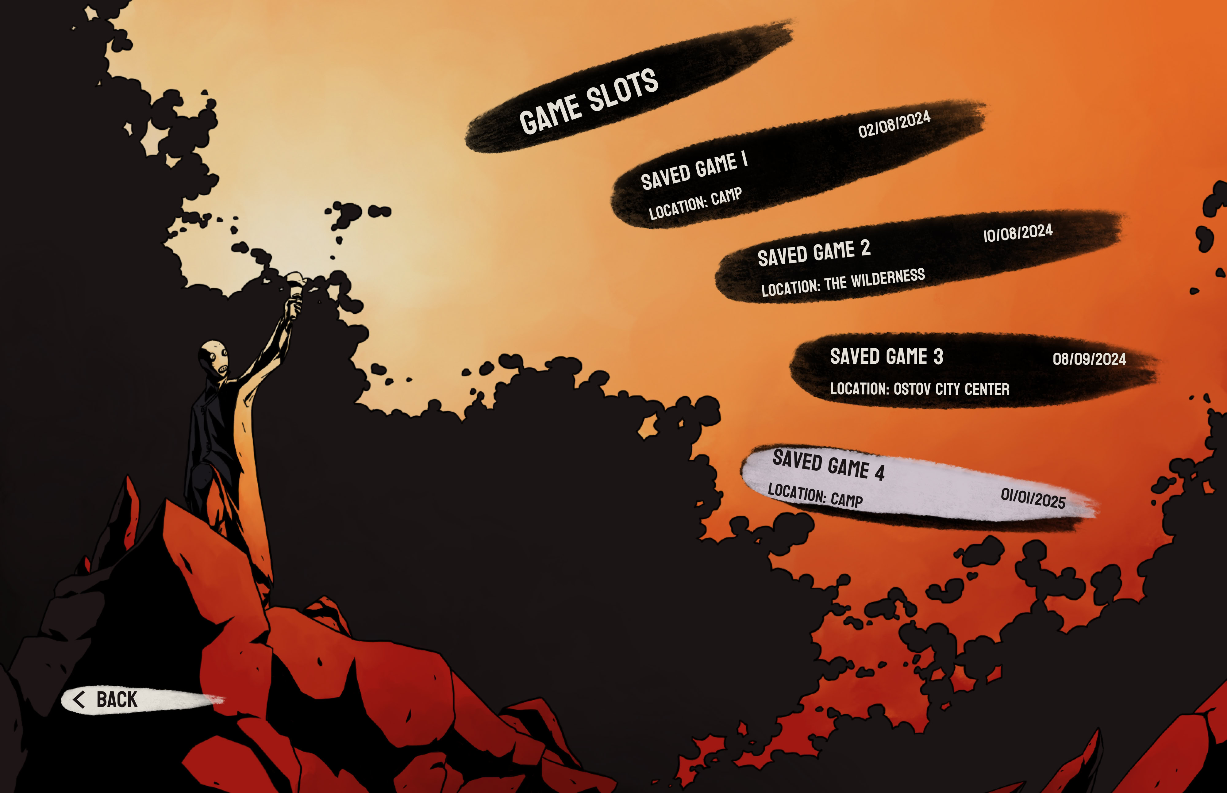
Final designs for the menu screens: main menu, quit game, settings and saved games.
Sketches and wireframes
First impressions are important, and since the main menu is the first thing the player sees I wanted to bring the gloomy style and atmosphere of the game into the menu layouts. To achieve this, I used imagery from the game for the backgrounds. I started by creating sketches to test different compositions before using wireframes to get a better idea of text size and placement.


The design system
The visual style was inspired by Mike Mignola’s artwork in the Hellboy Comics, combining strong outlines with paint-like effects to make important elements stand out to the player during the game. The colour palette mostly consisted of muted colours but the variety of shades made it possible to create contrast to highlight UI elements.
#7D767C
#A198A0
#CDC2CC
#DFD4DE
#DFDBDF
#7A7977
#65645F
#383735
#BFB4A8
#A89C90
#A01812
#E46B26
#E49E4A
#E4C581
#E4D2AB
#E4E0D7
#4A4850
#2E2C32
#1A1516
#323339
#29272C
#343736
#565752
#CFC5BB
#7D6363
#9E8282
#A1928F
#76777D
#605F64
Boronia brush for UI and buttons:
Font:

- a bold font to match the comic book aesthetic


Illustrated backgrounds for menu screens